When you put passion into everything you do, it tells. A brand shouldn't be any different.
Arapacha is a group of passionate people, experts in recreational activities for kids, teens and adults alike, ranging from school camps for kids to business workshops for companies, all with a secret ingredient that sets them apart from the competition: a playful spirit. And after 10 years in the market they wanted to look younger again. A fresh new start, with the next decade in mind.
The challenge was to communicate the Arapacha way of doing things in a clear and modern manner, without loosing the fun aspect, but also giving the brand a more mature and established image.
The competition was using the same old concepts like team work, diversity, connection and who can blame them, it worked for Arapacha for almost ten years too. So we decided to switch to concepts like play, movement, action and challenge.
For the new logo we decided to go back to the company’s roots, taking inspiration from the name itself. “Ara” means heaven in guarani language, and “pacha” comes from the word “ipaha” that means the highest point in the sky: The guarani tribes named like this to a famous blue guacamayo, that was the one “who flew the highest in the sky”. This was our starting point to communicate the "challenge" aspect of Arapacha, in a very playful manner.
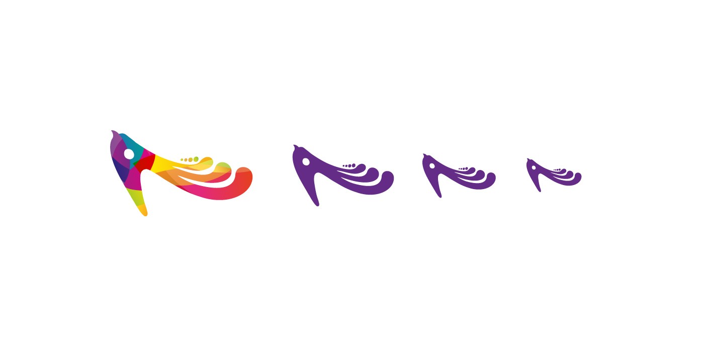
Playing with the idea of the arapacha, we created an abstract symbol reminiscent of a bird. The symbol adapts very well to different sizes and color limitations. We love it in its full color glory, but we are also very happy on situations where using just one color is absolutely necessary.
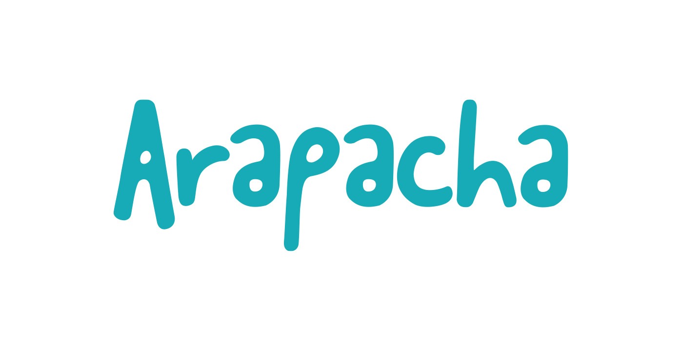
The wordmark, with a subtle hand made look, became the signature of the brand: the signature of an experience that can be attempted to copy, but never equally reproduced. The color palette was created to communicate the youthful spirit of the brand.
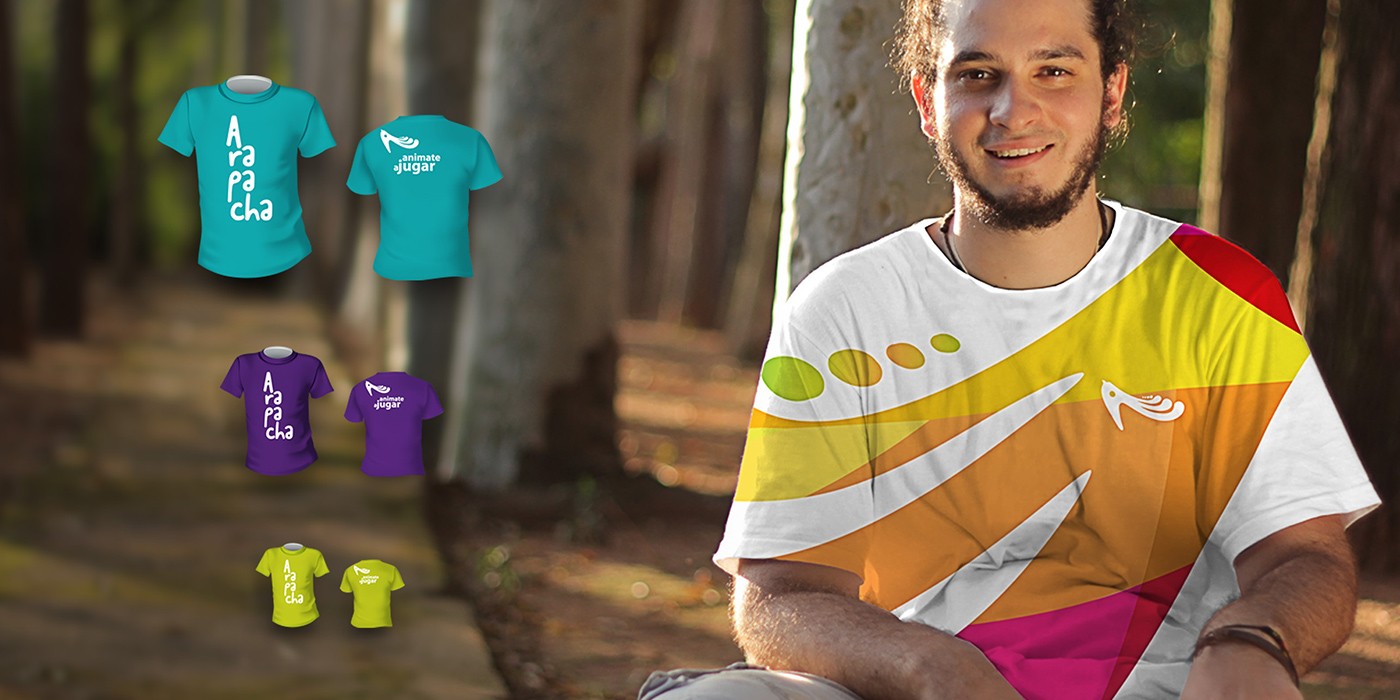
The people behind a business makes or breaks the business, so why not put them front and center?
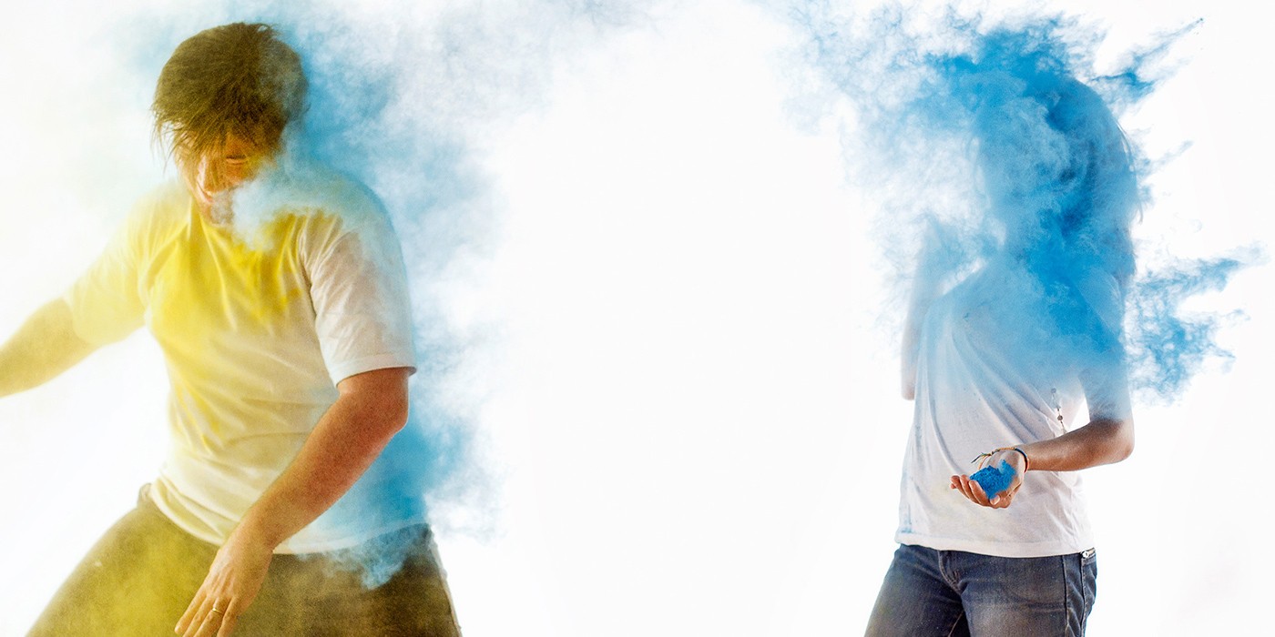
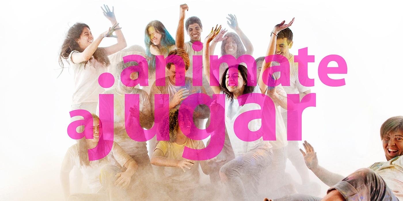
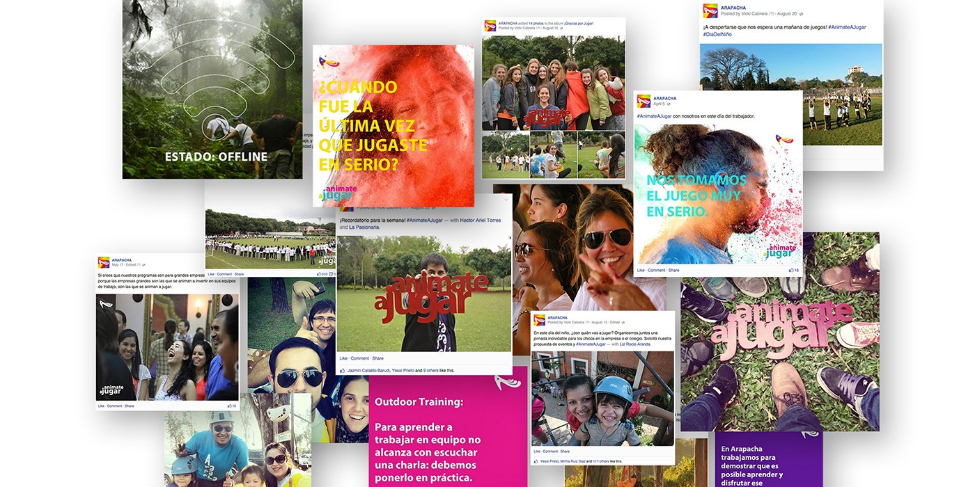
Arapacha’s business is about people, about the team creating unforgettable experiences for their clients. So we put the team at the front and center of every piece of communication, using photography as one of the most important elements of the new visual identity, giving the brand a modern, playful and energetic look, full of movement, action and above all, fun.
Let us help you get the communication your brand, product or service needs to keep growing.


